
Wonderful Ways of Adding Interest to Walls
Published: July 23, 2026
Walls are the largest canvas in any room, and yet they are the element most homeowners treat as an afterthought. A coat of paint goes up, the furniture comes in, and the walls quietly recede into the background. We understand the impulse. When there is so much to decide in a new home or renovation, it can feel like the walls can simply wait.
They cannot. Or rather, they can, but the room will always feel like something is missing.
At Pamela Hope Designs, we think about walls from the very beginning of a project, because the treatment you choose for a wall does not just add decoration. It sets the entire emotional register of the space. It determines how the room feels before a single piece of furniture is placed. A thoughtfully treated wall can make a modest room feel extraordinary. A flat, unconsidered wall can make an otherwise beautiful room feel unfinished.
In Houston, we work across a wide range of projects and clients, and the question of what to do with walls comes up in virtually every one. Below are the approaches we reach for most often, illustrated with rooms from our own portfolio, and the thinking behind each one.
Wallpaper: Pattern as Architecture
Wallpaper is perhaps the most powerful single decision you can make for a room's character. A well-chosen pattern does not merely decorate a wall. It creates an environment. It tells a story. It sets a mood that every other element in the room will respond to.
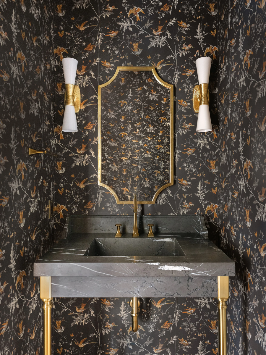
In the powder bath above, a dark botanical paper wraps every surface in a world of amber birds, silver foliage, and near-black ground. The result is not a room with wallpaper. It is a room that is the wallpaper. A shaped gold mirror and brass fixtures were chosen to speak the same warm, jeweled language. Nothing competes. Everything amplifies. Guests step in for sixty seconds and leave remembering it for years.
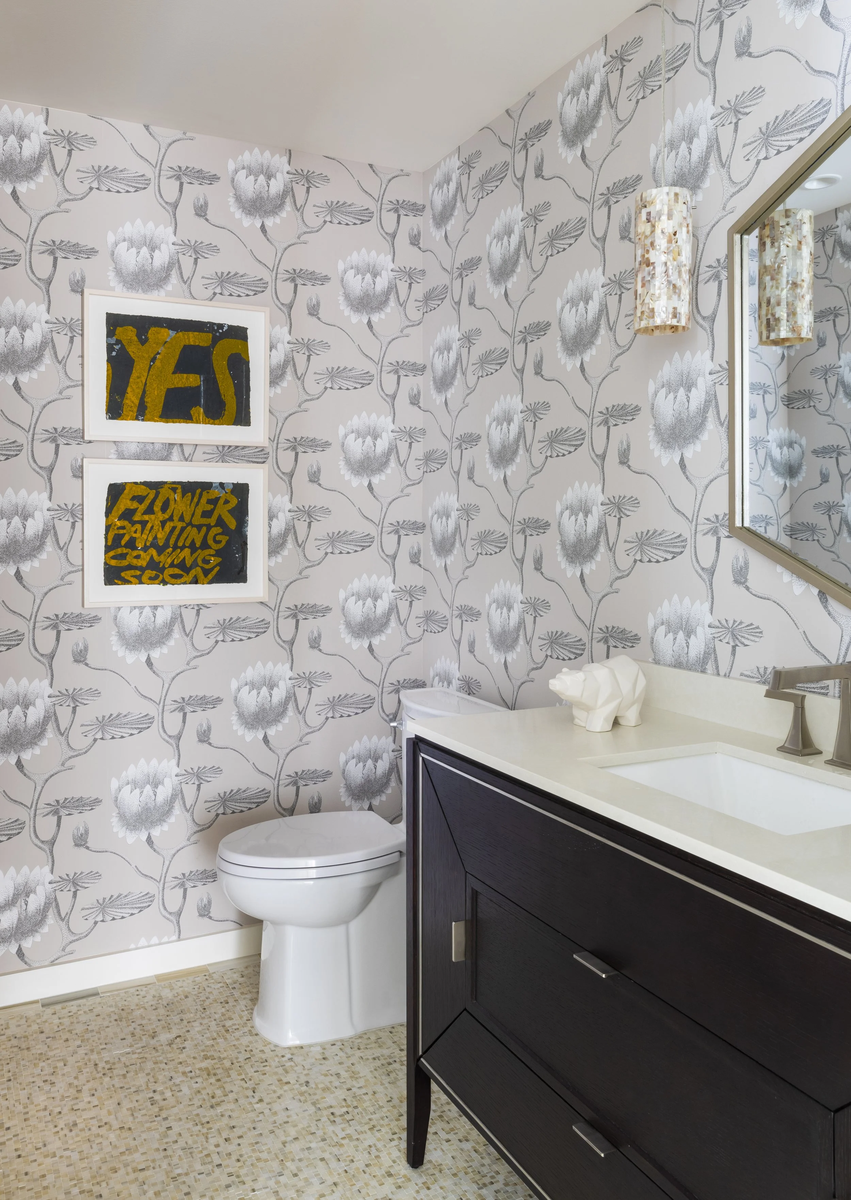
Wallpaper does not always need to be dark or dramatic to be effective. In this powder bath, a large-scale silver and white botanical print creates a room that feels light and garden-fresh, while two bold graphic art pieces hung directly on the patterned wall add wit and personality. This is a layering approach we love: letting the wallpaper establish the room's identity, then adding art that converses with it rather than competing against it.
The range of what wallpaper can do is remarkable. A wide-repeat botanical creates lushness. A tight geometric creates energy and precision. A tone-on-tone texture adds depth without committing to color. Grasscloth and linen weaves bring warmth and a tactile quality that painted walls simply cannot replicate. Whatever direction a project calls for, there is a paper that can take it there.
Pro Design Tip: In small rooms like powder baths and entry halls, lean into the wallpaper fully rather than stopping at chair rail height. Ceiling-to-floor coverage creates the most immersive effect and tends to look more intentional than a partial treatment. Often, the ceiling needs to be treated also. Usually using the same or a complimentary paper works well. Another option is to paint the ceiling with a paint color of decorative paint feature that blends well with the paper. The goal is to avoid a sharp contrast between where the walls end and the paper begins. The smaller the room, the bolder, deeper, richer and more dramatic you can go.
Natural Stone: Texture That Cannot Be Manufactured
There is nothing quite like natural stone on a wall. Not because it is expensive, though it often is, but because it carries something that no manufactured material can replicate: genuine character that has been forming for millions of years. Every vein, every variation in tone, every rough edge is evidence of the real world. Rooms with stone walls feel anchored in a way that is almost primal.
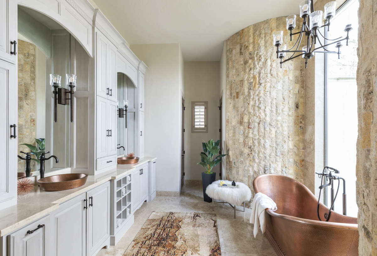
In this master bathroom, a curved travertine-style stone wall rises floor to ceiling behind a copper soaking tub, following the gentle arc of the room's architecture. The blocks are split-face with raw-edges and rich texture, creating a surface that shifts in tone as light moves across it throughout the day. Set against crisp white millwork and the warm glow of the copper tub and vessel sinks, the stone does not feel heavy or rustic. It feels ancient and refined at the same time. That tension is exactly what makes it so compelling.
Stone works beautifully in bathrooms, where its natural relationship with water feels appropriate, but it is equally striking in living rooms, entryways, and dining rooms where a fireplace or feature wall calls for something with real presence and permanence.
Pro Design Tip: When specifying natural stone for a feature wall, resist the urge to polish it to a high shine unless the room's aesthetic specifically calls for it. A honed or rough-cleft finish allows the stone's natural character to read clearly and tends to look more sophisticated in residential applications than a high-gloss surface.
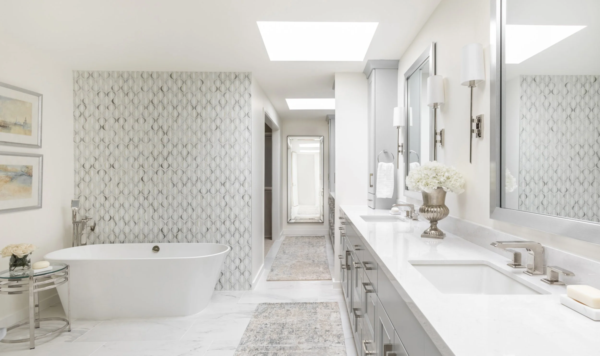
Statement Tile: Pattern, Texture, and Relief
Tile has always been a design staple in kitchens and bathrooms, but the most interesting use of tile we see right now is not in the predictable places. It is in the feature wall moments: the wall behind a soaking tub, the full expanse behind a vanity, the entry of a shower that carries a pattern bold enough to be art.
In this master bathroom, a dimensional tile in a soft ogee pattern covers the wall behind the freestanding tub, floor to ceiling. The tile itself is white and gray, entirely in keeping with the room's serene palette, but the three-dimensional relief of the pattern creates shadow and movement that make the wall feel alive. In a room that is otherwise defined by clean lines and polished surfaces, this single wall introduces the kind of quiet complexity that keeps the eye engaged.
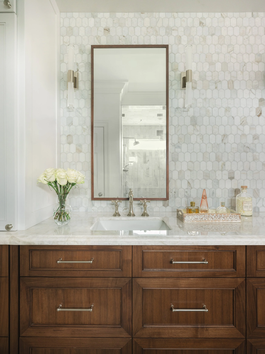
In another project, elongated marble hexagon tile climbs from countertop to ceiling behind a vanity, the natural veining of the stone providing pattern without any added color. The scale of the tile relative to the space, the consistent grout line, and the soft luminosity of the marble give this wall a quality that feels elegant and bespoke rather than a standard bathroom finish.
Tile as a wall treatment rewards specificity of choice. The shape, the scale, the finish, the grout color, and the installation pattern all contribute to the final effect. A small mosaic reads very differently than a large-format slab. A matte finish reads very differently than a gloss. These decisions deserve the same attention as any furniture or fixture selection.
Pro Design Tip: Grout color is one of the most underestimated decisions in tile work. A grout that closely matches the tile creates a seamless, monolithic effect that emphasizes the material itself. A contrasting grout draws attention to the pattern and the geometry of the layout. Neither approach is wrong, but knowing which effect you are after before you choose will avoid regret later. Always select a grout or two to sample when doing final tile selections. Grout gets overlooked and the best time to select color options is while you are working on the tile selections for the project.
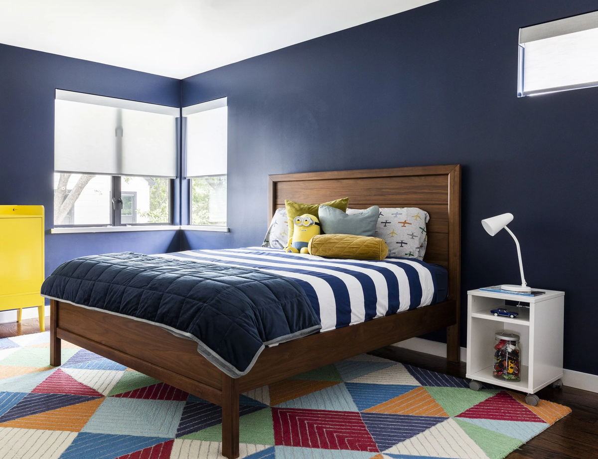
Bold Paint: The Transformative Power of Full Commitment
Paint is the most accessible wall treatment in any home, and the most underestimated. A soft, safe neutral is fine. But a room painted in a deep, saturated color is something else entirely. It is a room that has a point of view. And rooms with a point of view are the ones people remember.
In this child's bedroom, a rich navy covers all four walls without hesitation or apology. The effect is cocooning and confident, the kind of room a child can grow into rather than out of. The warm walnut bed, the pop of yellow from a cabinet, and the vivid geometric rug all stand out beautifully against the deep ground. The walls are not competing with the furnishings. They are completing them.
Bold paint rewards commitment. A single accent wall rarely achieves the same effect as enveloping the entire room, because a single wall can feel like a decision that was made halfway and then reconsidered. When all four walls, and ideally the ceiling and millwork, share a color, the room becomes a complete experience rather than a collection of surfaces.
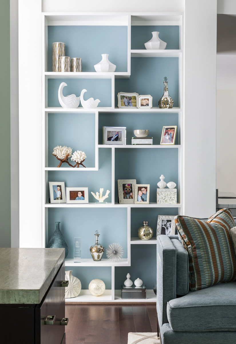
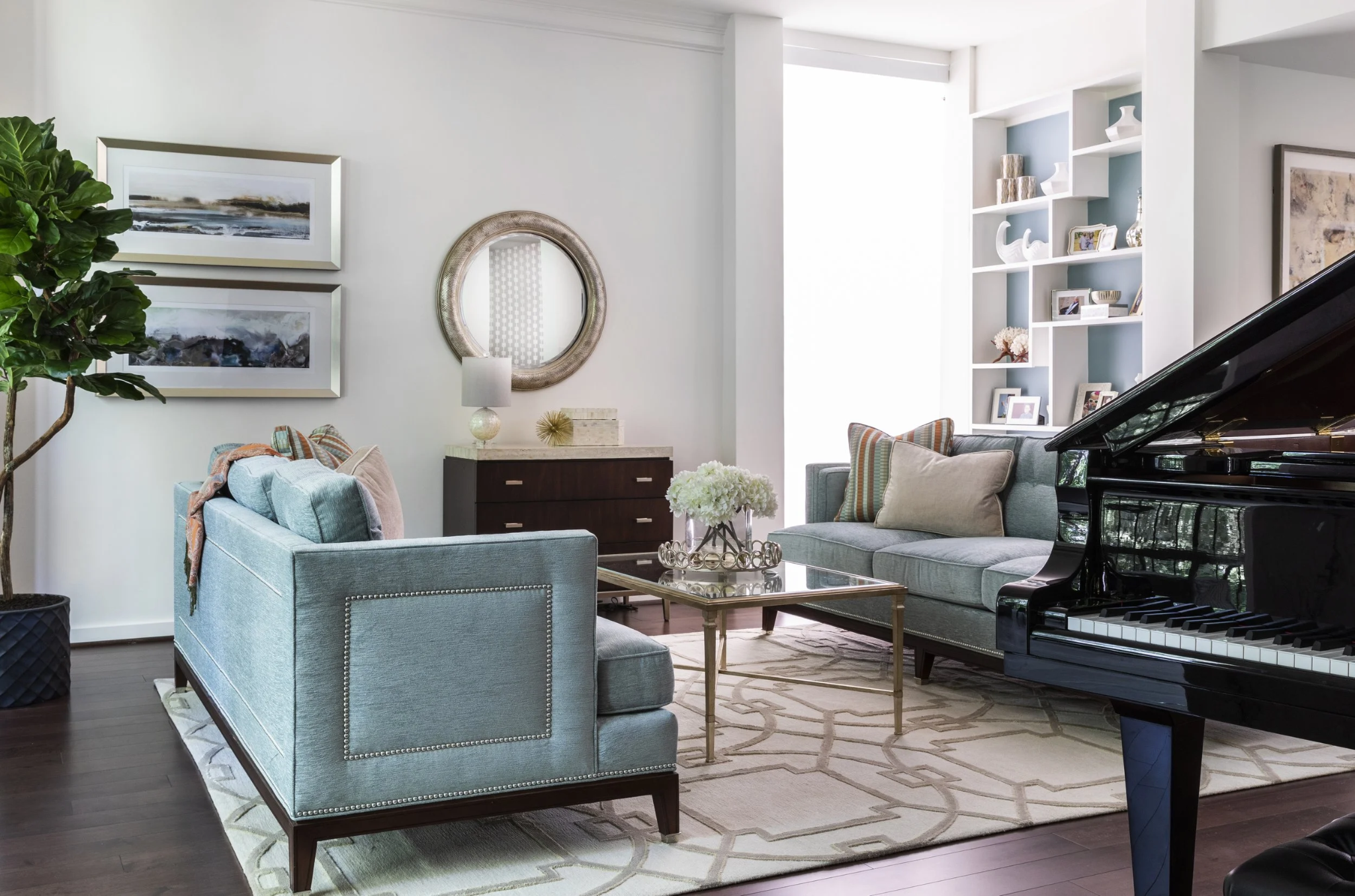
Paint does not have to mean a flat expanse of color on every wall. One of our favorite applications is painting the interior of a built-in bookshelf or cabinet in a color distinct from the surrounding millwork. In the living room above, the interior of an asymmetric white bookshelf is painted in a quiet teal-blue, a color that is present throughout the space but nowhere more intentional than in this single concentrated application. The effect frames every object on the shelves and gives the built-in the depth and presence of a piece of furniture.
Pro Design Tip: When committing to an accent paint color or wallpaper behind a wall or bookshelf, using it only on the the back wall creates a custom furniture or millwork appearance. This backdrop of 'color drenching' helps carve out visually the area you are enhancing.
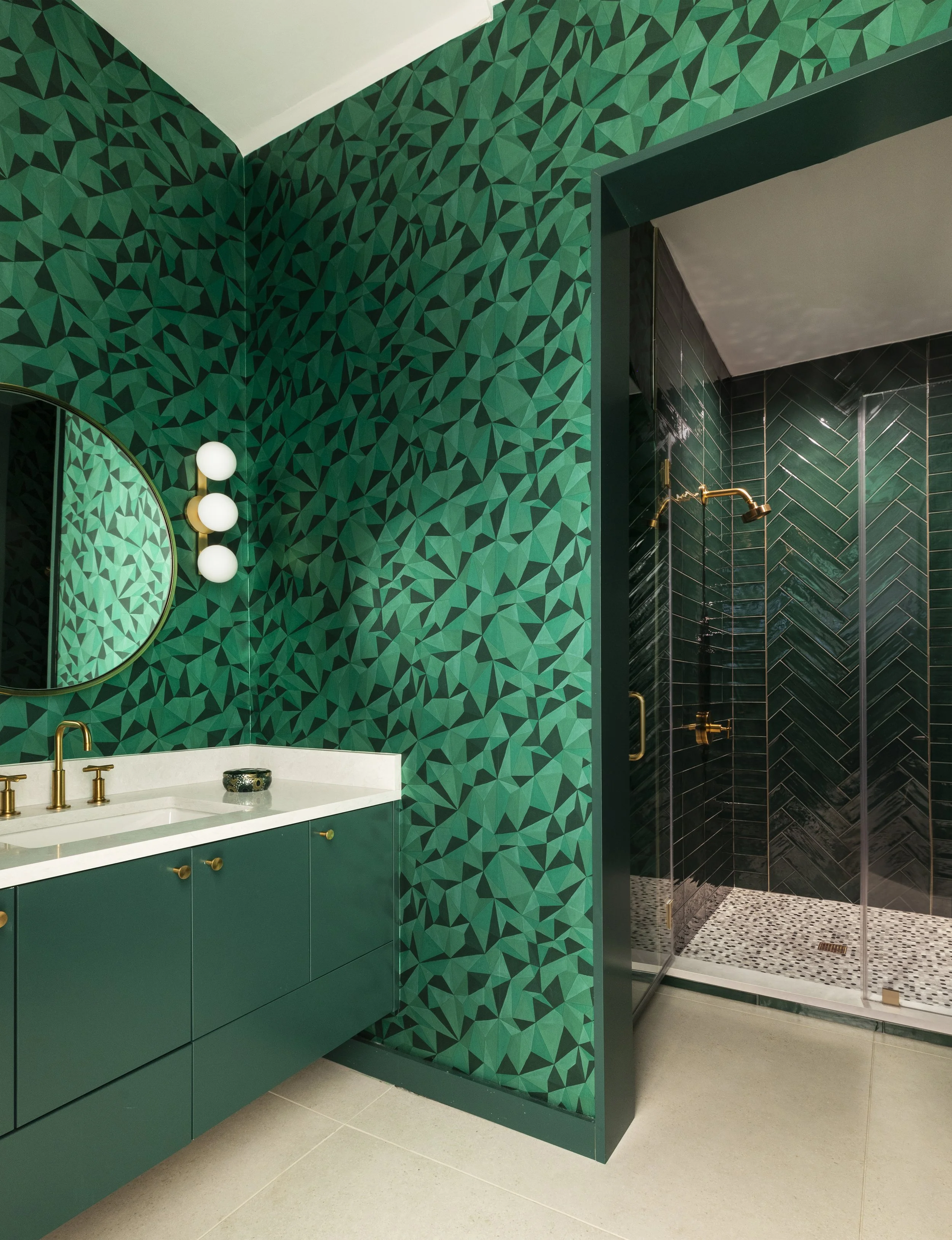
Wallpaper as Color Commitment: When Pattern and Hue Are One
Sometimes a project calls for a room that does not merely have an interesting wall. It calls for a room that is entirely, unapologetically itself. In those moments, wallpaper and bold color become one and the same thing, and the result is something that no single paint color or simple pattern could achieve alone.
In this primary bathroom, an emerald geometric wallpaper covers every surface from floor to ceiling, the faceted pattern shifting between dark and bright green as light moves across it. The vanity was painted to match. The fixtures are brass. The shower tile continues the green story in a different texture and scale. Every decision in the room reinforces the same singular commitment, and the result is a space that is as boldly personal as any room we have designed.
This approach requires confidence, both from the designer and the client. There is no halfway version of a room like this. But when the commitment is complete, the reward is a room that could not exist in any other home. It is, in the truest sense, designed.
Pro Design Tip: When committing to a saturated, immersive wallpaper treatment like this, match the vanity or cabinetry color to the dominant hue of the paper rather than contrasting against it. The continuity reads as intentional mastery rather than a room where multiple decisions were made independently. While not for everyone, keeping the colorway extended even to major selections like the tile can have a dramatic impact. Note: if you select a color you truly love, you will rarely get tired of it!
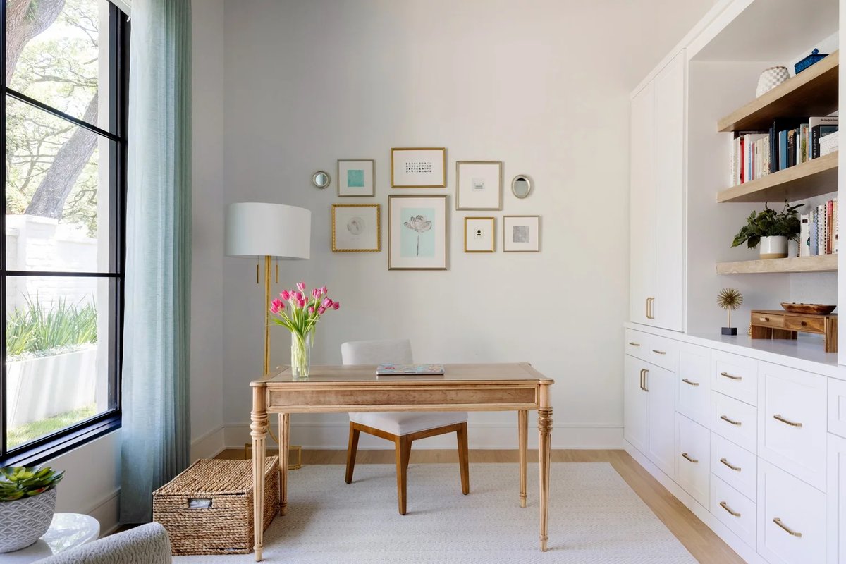
Art and Gallery Walls: Collected, Not Decorated
Art on walls is not the same as a wall treatment. But a thoughtfully composed collection of art, arranged with intention and hung with care, can do everything a wall treatment does: it adds visual interest, it communicates personality, it gives the eye a destination and the room a focal point.
In this home office, a gallery wall of mixed gold frames, art prints, and small mirrors occupies the wall above the desk in a way that feels genuinely collected rather than assembled. The frames vary in size and proportion. The art varies in subject and tone. The arrangement is asymmetric but balanced, with enough breathing room between pieces that each one can be seen as itself. The soft gray wall behind the collection does exactly what it should: it recedes and lets the art come forward.
The difference between a gallery wall that feels curated and one that feels cluttered almost always comes down to editing. It is not how many pieces you hang. It is how many pieces work. A wall of eight frames that have been chosen because they genuinely belong together will always outperform a wall of twenty frames that have been hung because they were available.
Art also works beautifully in combination with other wall treatments. Hanging pieces directly on wallpaper, as we did in the powder bath photographed above, creates a layered effect that feels more personal and more sophisticated than either element alone.
Pro Design Tip: When composing a gallery wall, begin by arranging the frames on the floor before committing a single nail to the wall. Play with the arrangement before hanging. The floor arrangement will reveal what the wall arrangement would have taken weeks to correct. Note: having relatively consistent outer margins and balanced sizes and shapes generally provide a more cohesive even with large variety in your collection.
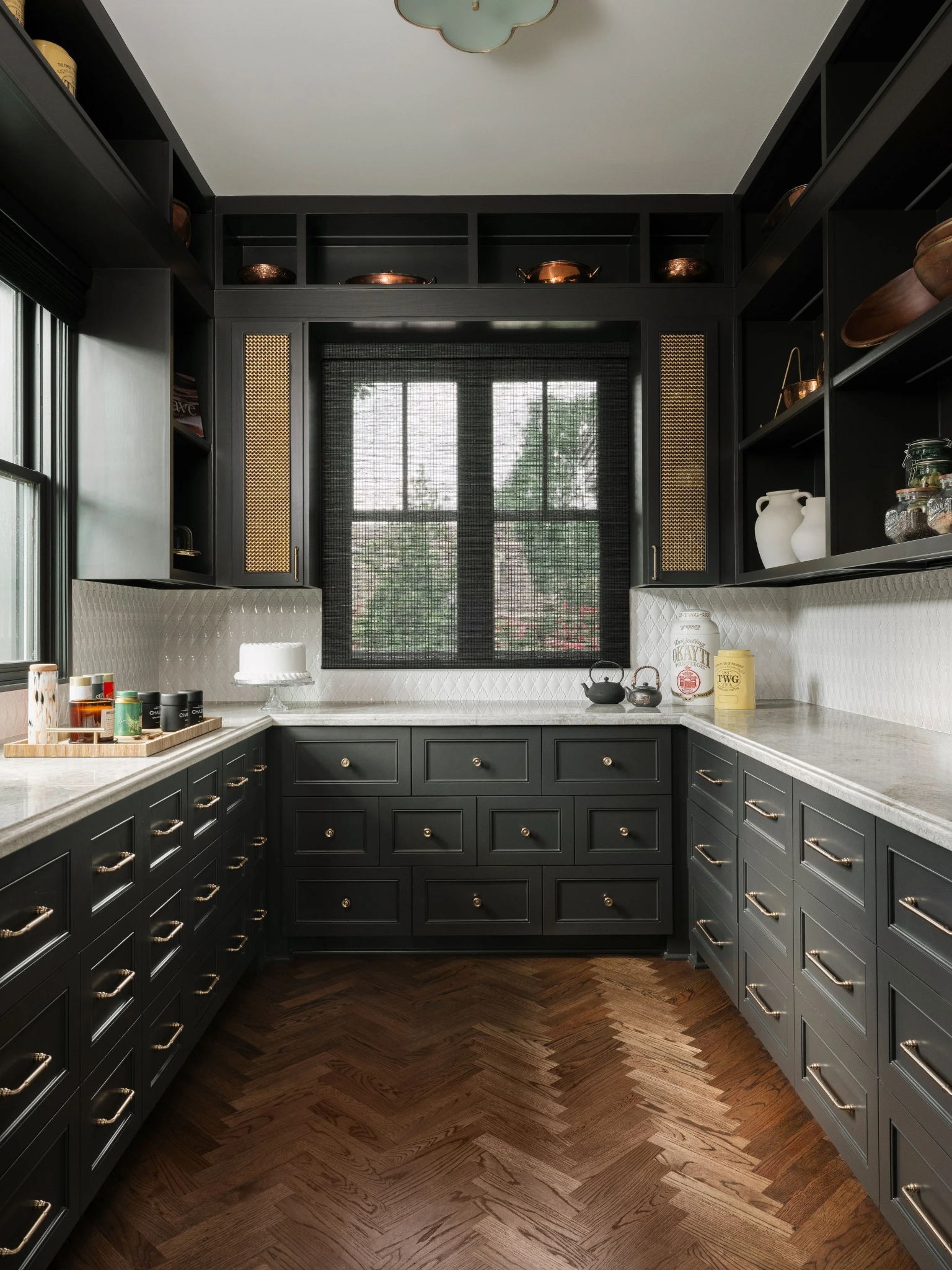
Millwork and Molding: Architecture as Decoration
Before wallpaper, before paint, before tile, there was millwork. The art of adding architectural detail to walls through paneling, molding, wainscoting, and built-in cabinetry is among the oldest and most enduring approaches to wall interest, and for good reason. Done well, it gives a room a sense of permanence and craftsmanship that surface treatments alone cannot achieve.
Board and batten brings vertical rhythm to a room and works across many aesthetics, especially farmhouse, country and rustic styles. Raised panel wainscoting introduces a classical quality that reads as elevated without being formal. Shiplap, particularly in a painted finish, adds texture and an easy, relaxed sensibility. And coffered paneling on a wall or ceiling creates a depth and geometry that elevates an otherwise standard room into something that feels genuinely architectural.
We love using millwork in combination with paint, particularly the color-drenching approach mentioned above. When paneling, millwork and the surrounding wall are painted in the same saturated color, the depth of the millwork profile becomes a design element in itself, creating shadow and relief that no flat surface can replicate. The result is a room that has both color and architecture, and the two work together in a way that is greater than either alone.
Pro Design Tip: The height at which you terminate wainscoting or wall paneling matters enormously. Standard chair rail height, around 36 inches, is appropriate for traditional settings. For a more dramatic, contemporary effect, consider running the paneling to 48 inches or higher, which commands more visual presence and reads as a more deliberate design statement.
Textile Wall coverings: Warmth That Paint Cannot Provide
There is a category of wall treatment that sits between paint and wallpaper, and it is one of the most underutilized in residential design: textile wallcoverings. Grasscloth, linen, sisal, jute, and woven fabric wallcoverings bring a warmth and tactile dimension to walls that no painted surface can replicate. They absorb sound. They catch light differently from every angle. And they age beautifully, developing a patina over time that only makes a room feel more considered.
Grasscloth in particular has a quality that our clients consistently respond to. It is neither loud nor aggressive. It does not demand attention the way a bold pattern does. But it transforms the quality of a room in a way that becomes immediately apparent the moment you walk in. Walls that might otherwise feel flat and unremarkable become warm and layered. The texture reads differently in morning light than in lamplight, which gives the room a quality of life that painted walls rarely achieve.
Textile wallcoverings work best in rooms that are not subject to significant moisture or heavy use: living rooms, dining rooms, primary bedrooms, and libraries are ideal. They pair beautifully with warm wood tones, leather, and natural fiber rugs, and they tend to ground rooms that might otherwise feel too polished or too perfect.
Pro Design Tip: Natural fiber wallcoverings like grasscloth will show seams, and this is by nature of the material, not a flaw in the installation. The most graceful approach is to embrace it: choose a room where the seams will read as part of the texture rather than a disruption of it, and work with an experienced wallpaper installer who understands how to minimize their visual impact through careful placement.
Decorative Plaster: The Finish That Lives and Breathes
Venetian plaster and its relatives, including Roman clay, and limewash, represent a category of wall finish that is both ancient and entirely contemporary. These are not paint colors. They are materials, applied by skilled hands in multiple passes, burnished to a depth and luminosity that no flat paint can approach. Each application is unique. No two walls finished in Venetian plaster will look exactly the same.
The quality that distinguishes plaster finishes from everything else is movement. As light shifts across a plaster wall throughout the day, the surface shifts with it. The color appears to change. The depth of the finish becomes apparent in a way that photographs rarely capture. It is, quite simply, alive in a way that other wall treatments are not.
We reach for plaster finishes most often in rooms where we want to add depth and glamour without pattern: primary suites where a soft, enveloping quality is the goal; dining rooms where the shifting quality of the finish catches candlelight beautifully; foyers where the material itself makes a statement about craft and attention before a guest has even entered the home. Ceilings and fireplace surrounds can also be eye-catching with this treatment.
Pro Design Tip: Decorative plaster finishes require an experienced craftsman. The skill and consistency of the person applying the material will determine the quality of the final result far more than the product itself. Ask to see completed projects, not just samples, before committing to an applicator for this type of finish.
The Wall Is Never Just the Background
Every technique described here shares something in common. Each one asks you to make a decision about what a room should feel like before anything else is placed in it. That is, in many ways, the essence of what we do at Pamela Hope Designs. We begin with how a space should look and feel, and then we work backward to every decision that will create that feeling.
Walls are where that work begins. They are not the background. They are the foundation. And when they are treated with intention, whether through a deeply saturated paint, a hand-applied plaster, a carefully composed gallery of art, or a wallpaper that stops you in your tracks, the entire room rises to meet them.
If your walls are ready for more, we would love to help you discover what they are capable of.
We are off to our next design project.
Fondly,
Pamela Hope Designs
Meet Pamela
A LUXURY INTERIOR DESIGNER IN HOUSTON
Pamela O’Brien is the founder of Pamela Hope Designs in Houston, Texas. Pamela is an award-winning luxury interior designer, writer, and speaker. Prior to founding Pamela Hope Designs, Pamela served as a spokesperson in media and public affairs, working with media outlets like Dateline NBC and 48 Hours. This experience allowed her to travel the world and furthered her love for travel, culture, and interior design. After attending an executive course at the Harvard Graduate School of Design, Pamela launched her own interior design firm full-time. Pamela is known for building strong relationships with her clients, who later become friends and collaborators. She is highly influential in the Houston interior design space and shows no signs of slowing down.


Meet Danna
A LUXURY INTERIOR DESIGNER IN HOUSTON
Danna Smith has more than 30 years of experience in the design industry. She has been a buyer and merchandiser for four luxury showrooms in Houston and Dallas. Smith teaches an evening course at Houston Community College to nurture her passion for developing future design stars. Since joining Pamela Hope Designs in 2015, she has worked on some of her most beautiful and innovative projects yet.