
7 Ways Paint Can Transform Your Space
Published: March 12, 2026
At Pamela Hope Designs, we believe transformation doesn’t always require demolition or lots of new purchases, sometimes, it can begin with a single brushstroke.
Paint is one of the most powerful, accessible, and emotionally impactful tools in interior design. It can expand a room, warm it up, calm it down, highlight architectural details, and completely shift the way you experience your home or office.
Whether you’re refreshing one room or reimagining your entire space, here are seven sophisticated ways paint can truly transform your environment.
1. Create Architectural Drama Without Renovation
Not every home comes with elaborate millwork or custom paneling, but paint can create the illusion of architectural depth.
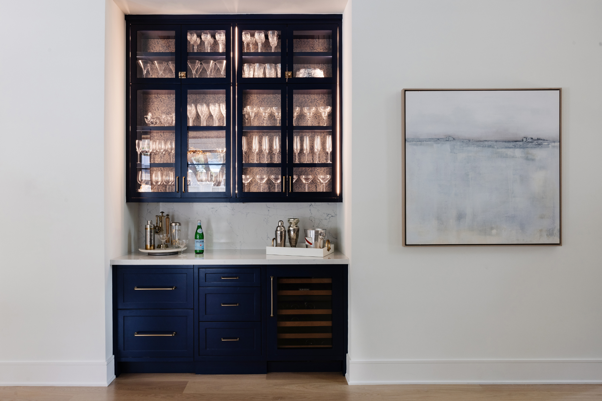
A thoughtfully painted ceiling, a saturated accent wall, or a monochromatic trim treatment can add dimension where there was none before. We often use deeper tones on millwork or doors to create contrast and richness without adding construction costs.
One of our favorite techniques? Painting walls, trim, and doors in the same hue but varying finishes. The subtle sheen contrast adds depth while keeping the look elevated and cohesive.
Pro Design Tip: Consider painting interior doors in a rich charcoal, navy, or soft espresso tone to add sophistication without overwhelming the space, or select another architectural feature in the home, such as built-ins or a mantel.
2. Expand or Intimately Define a Room
Paint is magic when it comes to spatial perception.
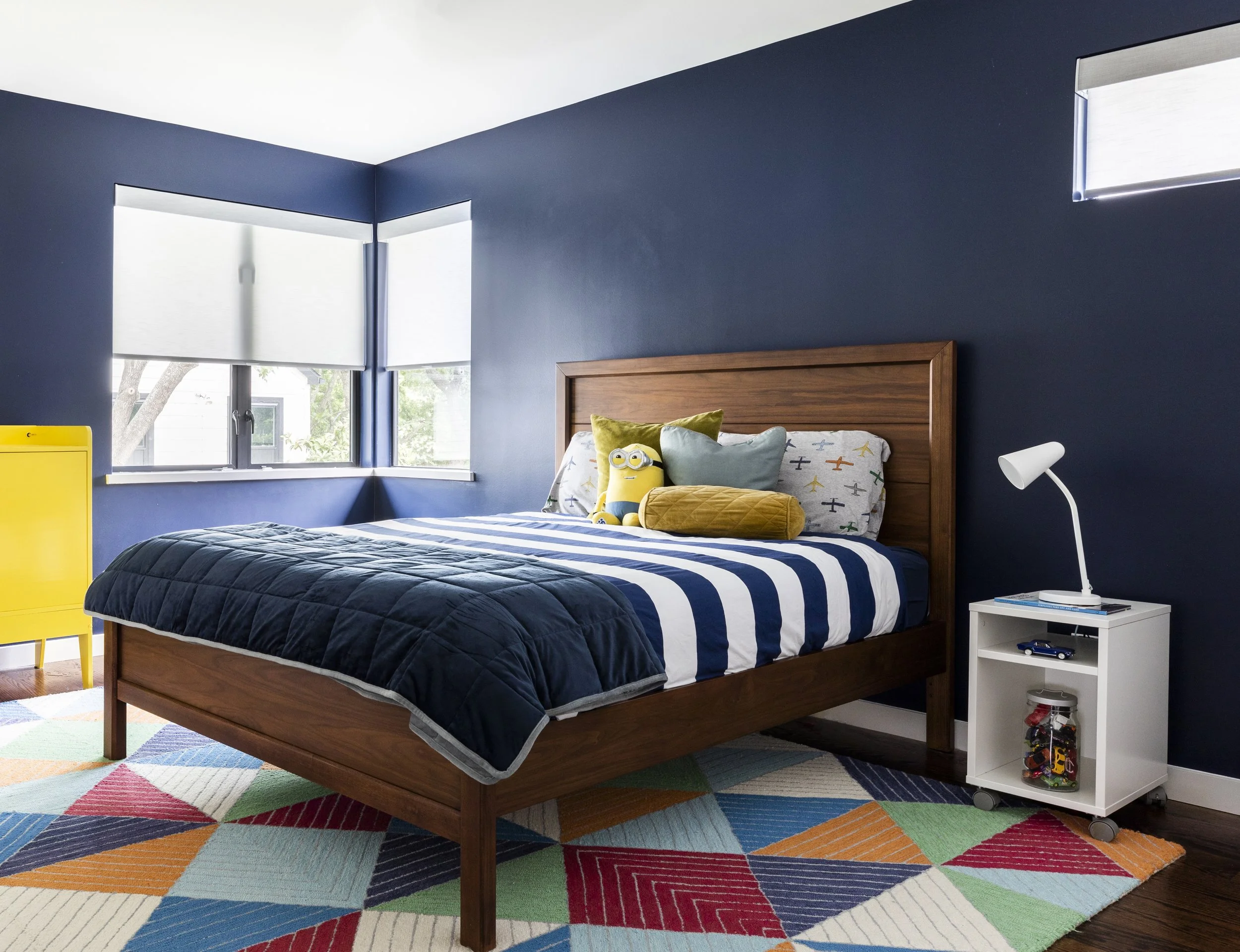
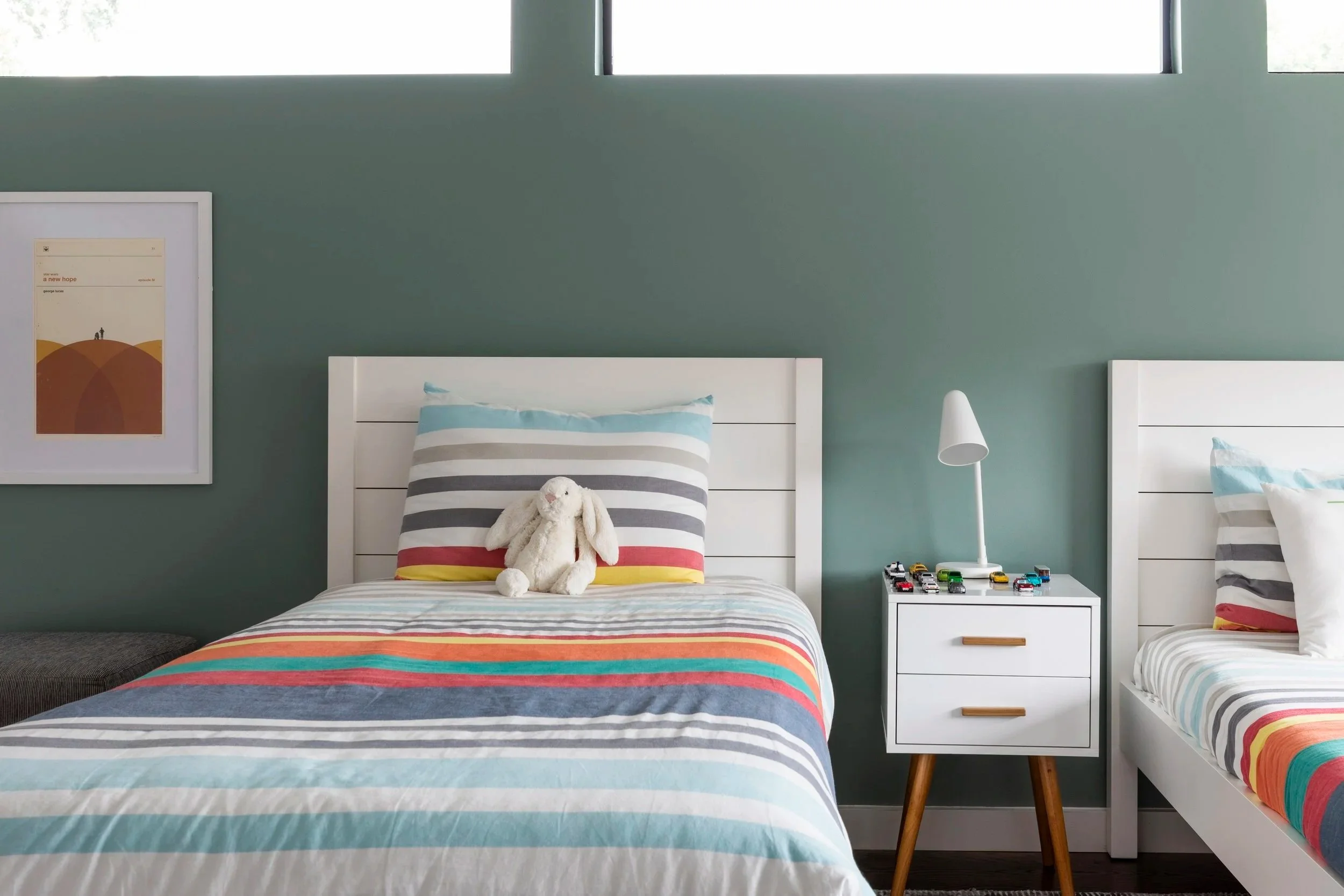
Lighter tones can make smaller rooms feel expansive and airy. Deeper, moodier shades can make large spaces feel grounded and intimate. In open floor plans — especially common in Houston homes — strategic color placement helps define zones without adding walls.
For commercial clients, this is particularly impactful. A color shift can subtly guide clients from reception to meeting spaces, creating an intuitive flow.
Pro Design Tip: When working with bold color, consider using it on multiple walls and possibly extending it across trim or cabinetry for a fully enveloped effect. A half-hearted accent wall often feels disconnected; a fully embraced color feels intentional. Look how much more fun these boys’ rooms are with colorful walls!
3. Elevate Ceilings Beyond “Builder White”
The ceiling — often called the “fifth wall” — is one of the most underutilized design opportunities.
A soft blush, a smoky gray, or even a pale sky blue can add warmth and interest without overwhelming the room. In spaces with crown molding or architectural detail, painting the ceiling in a slightly lighter version of the wall color creates depth while maintaining cohesion.
In dining rooms or powder baths, we sometimes go bold with lacquer or high-gloss finishes. The reflective quality unforgettably adds glamour and drama.
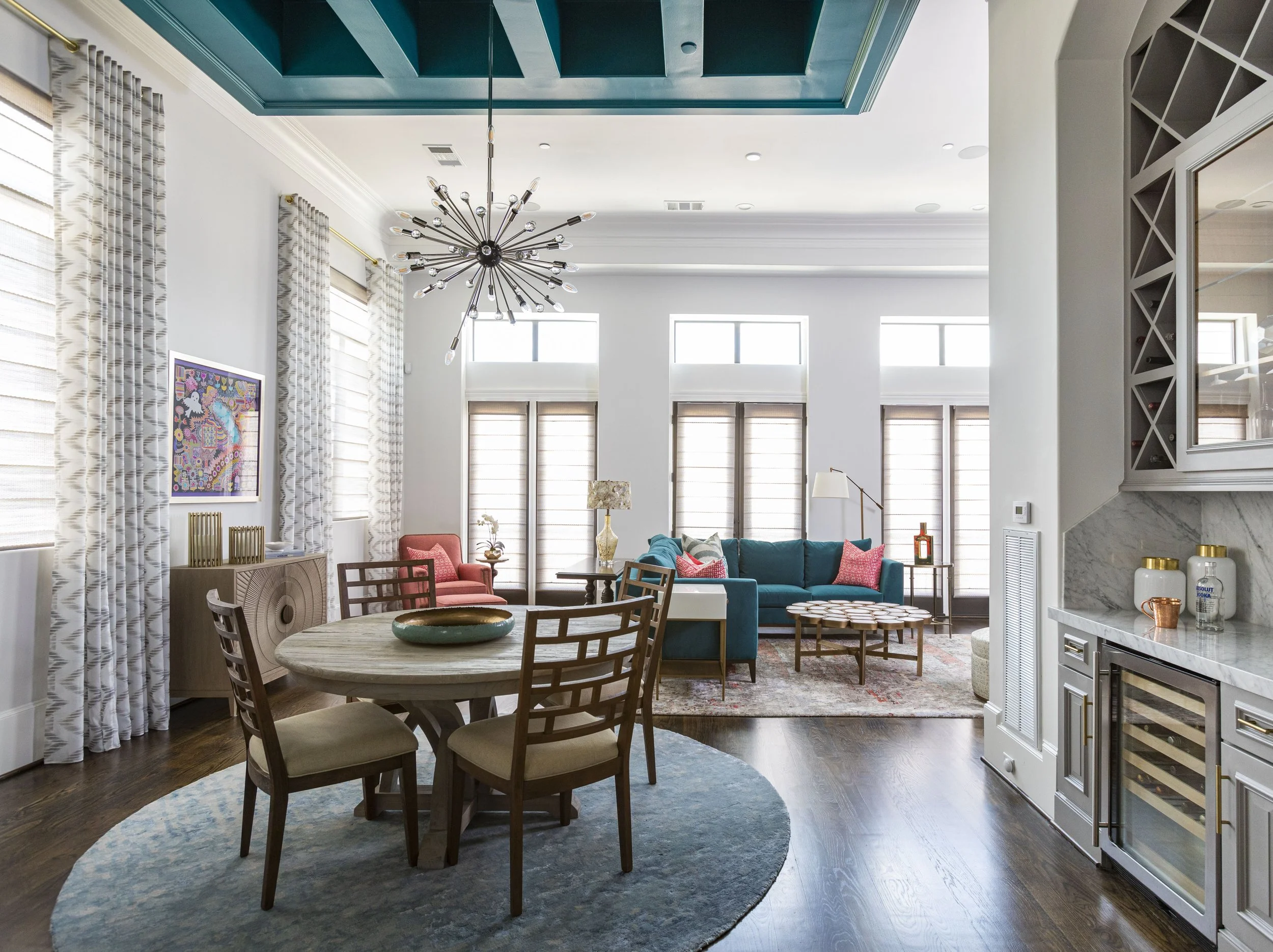
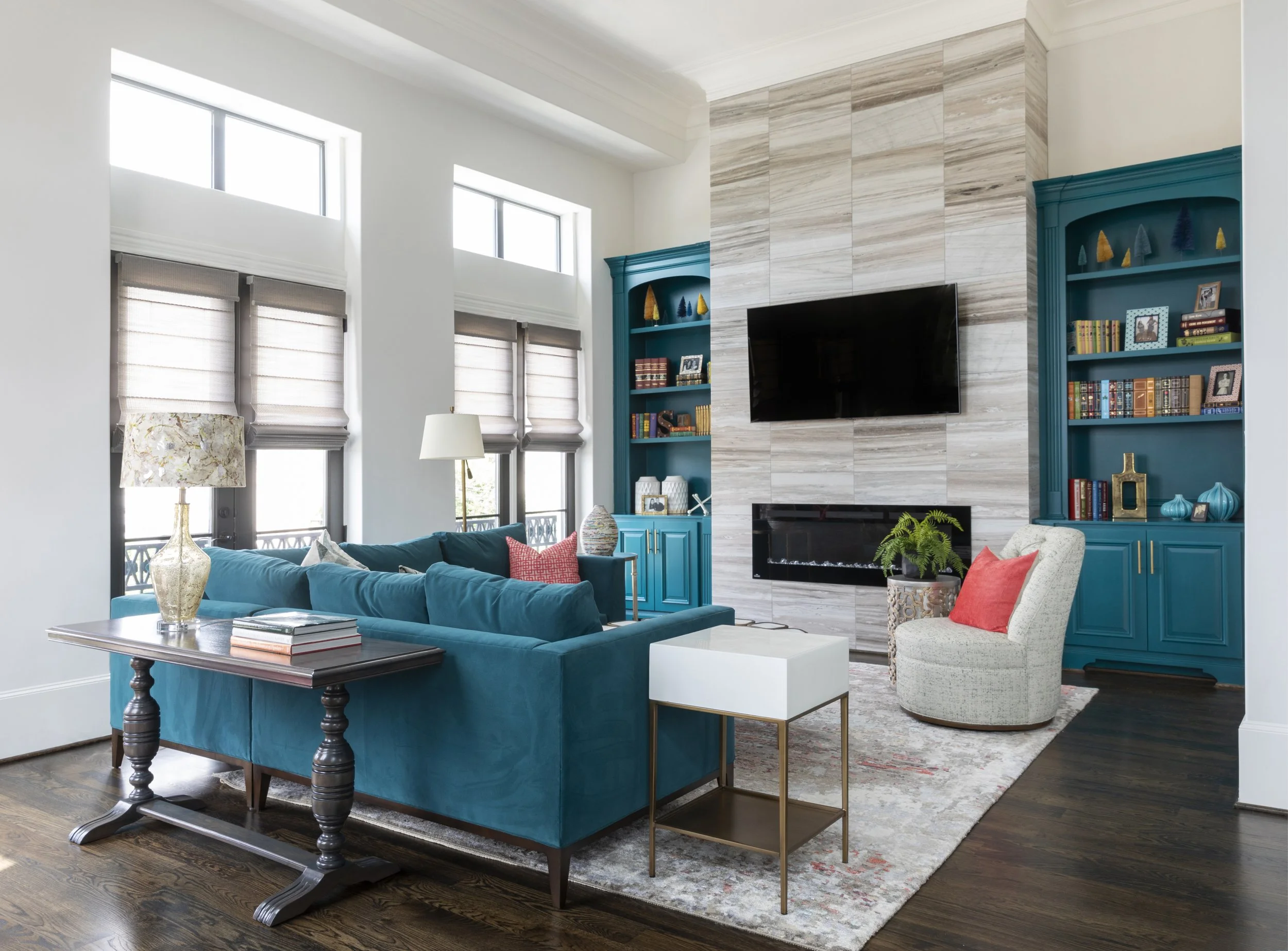
We have a favorite client whose first project with PHD started with a clear vision: to transform her newly built townhome into a space that truly reflected her personality. Beginning with a clean, bright white canvas, we introduced moments of bold color—like the teal dining room ceiling detail, custom built-in bookshelves, and the mantel—to add depth and character. Layered with vibrant furnishings, the result is a beautifully balanced space that feels both expressive and refined.
Pro Design Tip: In rooms with lower ceilings, avoid stark white contrast. A gentle tonal shift can make the ceiling feel taller and more integrated.
4. Reinforce Your Brand or Personality
Paint isn’t just aesthetic — it’s both emotional and strategic.
For homeowners, color is a reflection of personality. For commercial spaces, it becomes a tool to reinforce brand identity.
In commercial projects, we often pull from a company’s branding to guide color choices and even help with wayfinding. For example, we recently recommended painting an open break room—located at the end of a long corridor—in the firm’s signature red. It’s a bold choice, but break rooms are meant to feel energizing and fun. The result is a space that’s easy to locate, visually impactful, and seamlessly tied to the brand—all achieved with just a few gallons of paint.
In residential spaces, the approach is more personal. This might look like a soft sage green for someone seeking calm, or a warm clay tone for a client who loves to host and create an inviting atmosphere.
Pro Design Tip: Start with how you want to feel in a room. Energized? Calm? Sophisticated? Playful? Paint should support that intention.
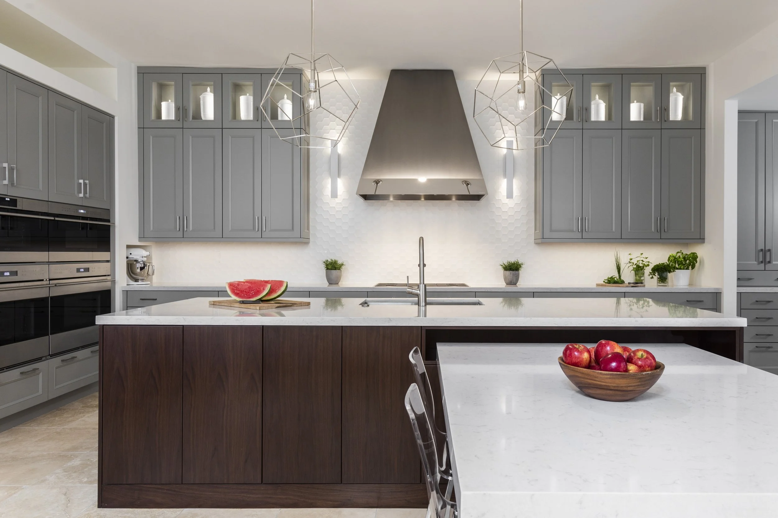
5. Highlight Millwork, Cabinetry & Built-Ins
Custom millwork deserves attention — and paint helps it shine.
A built-in bookcase painted in a contrasting shade can anchor a living room. A kitchen island in a deep navy or olive creates focal interest without disrupting overall harmony. Painted cabinetry can refresh a dated kitchen at a fraction of the cost of a full renovation.
In one of our favorite remodeling projects, we transformed a once-dark, compartmentalized kitchen into a light-filled gathering space mainly by adjusting the cabinetry palette and wall color. The result felt entirely new — yet structurally unchanged.
Pro Design Tip: Don’t overlook the interior of built-ins. A subtle contrasting hue on or behind shelves adds depth and makes styling pop. Another trick is to add or adjust the lighting. This can also create subtle changes to the appearance of the cabinet interior color.
6. Introduce Texture Through Specialty Finishes
Paint doesn’t have to be flat.
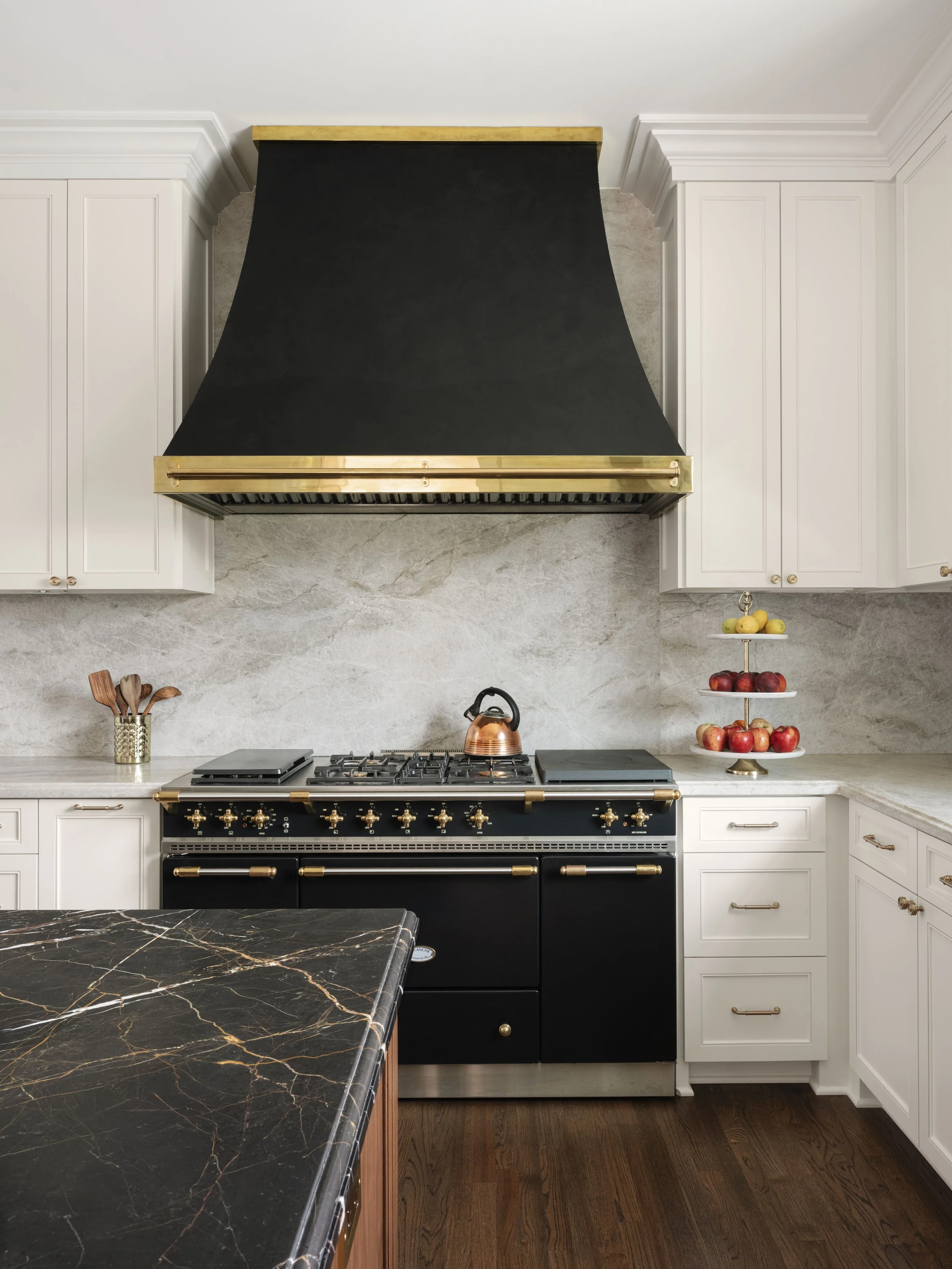
Limewash, Venetian plaster, color washing, and high-gloss lacquer finishes introduce texture, movement, and dimension. These treatments elevate walls into works of art. They also are often a clever and cost-effective way to mimic a more expensive product than paint. For example, this vent hood, if made of metal, would have cost more than $10,000. Instead, we made the hood out of wood and covered it with black Venetian plaster. Real brass bands lent authenticity but the cost still came in at less than a third of our original quote.
In modern or industrial settings, a textured wall finish can soften harder materials like steel and concrete. In traditional homes, a subtle plaster finish can add timeless elegance.
Specialty finishes are particularly impactful in powder baths, dining rooms, or entryways — spaces where guests linger and details matter.
Pro Design Tip: Always test specialty finishes in multiple lighting conditions. Light changes dramatically throughout the day, and texture reacts beautifully — or unexpectedly — depending on natural light..
7. Unify an Entire Home with a Cohesive Palette
One of the most transformative uses of paint is creating cohesion.
A thoughtfully curated palette that flows from room to room brings a sense of harmony and sophistication. Even when individual spaces feature different colors, a consistent undertone ensures the home feels intentional rather than disjointed.
At PHD, we often develop a “whole-home paint story” that considers everything—from wall colors and trim to cabinetry and even the front door. This layered approach creates visual continuity, which is especially important in renovation projects where older and newer areas need to blend seamlessly.
Early in my design career over 25 years ago, I taught clients to begin with what I call a “basic neutral.” This is a foundational hue used throughout key areas like hallways, stairwells, and main living spaces—anywhere that doesn’t call for a distinct color moment.
This neutral can lean warm or cool, but choosing the right undertone is one of the most important decisions you’ll make. Once it complements your fixed elements—like flooring, tile, and countertops—you’ll have a foundation that allows everything else in the home to truly come together.
Pro Design Tip: Before choosing a single paint color, view all selections together. Paint lives in relationship to other paint — and that relationship is what creates beauty.
The Emotional Impact of Paint
Beyond aesthetics, paint has the power to shape how a space feels.
It can refresh a historic home while still honoring its character. It can soften a modern interior, making it feel more inviting. It can even transform a corporate office into a space that feels energized and inspiring.
We often remind clients that paint isn’t just color — it’s atmosphere. When chosen thoughtfully, it enhances how you live and work every day.
Ready to transform your space?
Whether you’re updating a single room, preparing a home for sale, or designing a commercial space that reflects your brand, paint is one of the most impactful tools in the design process.
At Pamela Hope Designs, we guide our clients through intentional color selection, finish choices, and whole-home cohesion—ensuring every detail supports your vision and lifestyle.
If you’re considering a refresh, we’d love to help you explore what’s possible…
We are off to our next design project.
Fondly,
Pamela Hope Designs
Meet Pamela
A LUXURY INTERIOR DESIGNER IN HOUSTON
Pamela O’Brien is the founder of Pamela Hope Designs in Houston, Texas. Pamela is an award-winning luxury interior designer, writer, and speaker. Prior to founding Pamela Hope Designs, Pamela served as a spokesperson in media and public affairs, working with media outlets like Dateline NBC and 48 Hours. This experience allowed her to travel the world and furthered her love for travel, culture, and interior design. After attending an executive course at the Harvard Graduate School of Design, Pamela launched her own interior design firm full-time. Pamela is known for building strong relationships with her clients, who later become friends and collaborators. She is highly influential in the Houston interior design space and shows no signs of slowing down.

Meet Danna
A LUXURY INTERIOR DESIGNER IN HOUSTON
Danna Smith has more than 30 years of experience in the design industry. She has been a buyer and merchandiser for four luxury showrooms in Houston and Dallas. Smith teaches an evening course at Houston Community College to nurture her passion for developing future design stars. Since joining Pamela Hope Designs in 2015, she has worked on some of her most beautiful and innovative projects yet.