
5 Ways to Bring Earthy Colors to Your Home
Published: April 23, 2026
There is a reason so many of our clients are drawn to earthy, grounded color palettes right now. After years of cool grays and stark whites dominating the design conversation, something has shifted. Beautifully so. Homeowners are rediscovering the warmth of nature: the depth of a forest floor, the richness of aged leather, the quiet authority of dark stone. These are colors that do not shout. They settle. They ground you the moment you walk through the door.
At Pamela Hope Designs, we have been layering earthy tones into our projects for years, long before they became the trend du jour. And what we have found, time and again, is that rooms built on these palettes feel both timeless and deeply personal. They wear well. They age gracefully. And they make people feel genuinely at ease.
Here are five ways to bring earthy color into your home, with intention, with sophistication, and with results that will still feel right a decade from now.
Concept #1
Commit to a Deep, Nature-Inspired Wall Color
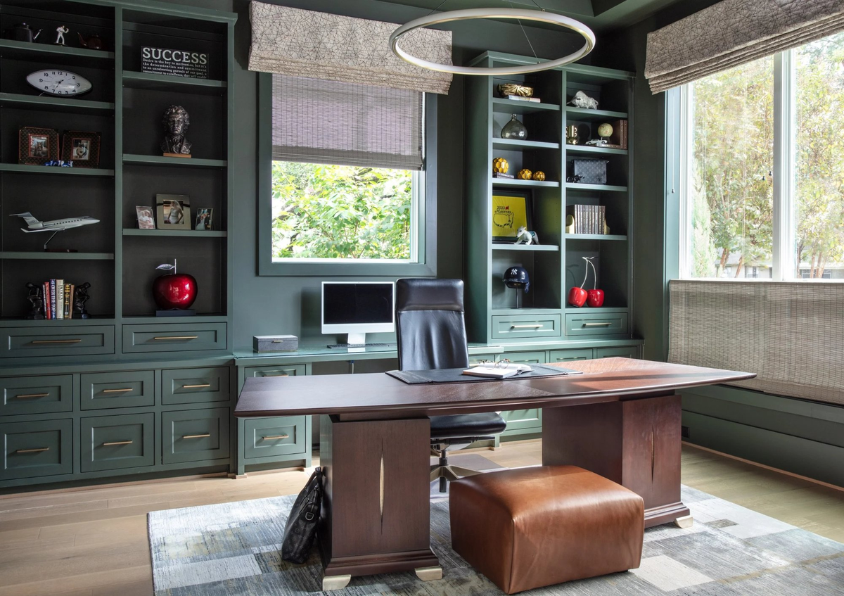
The single most transformative thing you can do with earthy color is commit to it fully. A half-hearted application, a single accent wall or an uncertain swatch, rarely captures the depth these tones are capable of. When you envelop a room in a rich, saturated hue, something remarkable happens. The space becomes its own world.
In the home office above, we painted the walls, trim, and custom built-ins in a dusty forest green, a color that evokes moss, old library shelves, and the shade of mature hardwoods. The result is a room that feels focused and calm, serious without being cold. The color does the work that no single piece of furniture could achieve alone.
The key to making a bold, enveloping wall color succeed is what you layer alongside it. Warm wood tones, burnished metals, and tactile textiles prevent the room from feeling like a cave. Light, both natural and artificial, keeps it alive. A pop of color or two, like these tongue-in-cheek fruit sculptures keep things fresh rather than heavy.
Pro Design Tip: When working with deep greens, deep navies, or rich earth tones on walls and millwork simultaneously, choose a paint finish with a slight sheen on the cabinetry. The subtle difference in reflectivity adds dimension and keeps the monochromatic palette from feeling flat.
Concept #2
Let Earthy Colors Anchor Specialty Spaces
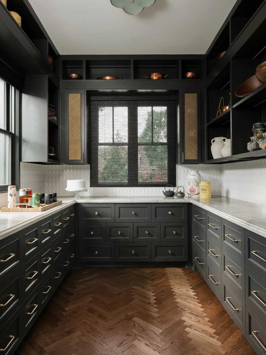
Some of the most successful earthy-toned rooms in our portfolio are not living rooms or primary suites. They are the specialty spaces that guests encounter briefly and remember for years. A baker's pantry. A powder bath. A butler's pantry. These are rooms where you can take a creative risk, because the stakes of daily living are lower and the impact of a bold choice is extraordinarily high.
The baker's pantry above is a masterclass in this approach. Matte near-black cabinetry wraps the entire room, grounded further by herringbone wood floors in a warm, honeyed tone. White marble countertops provide the essential contrast that keeps the palette from becoming heavy. Brass hardware, from the drawer pulls and knobs to the delicate flush mount above, catches the light and adds warmth against all that dark cabinetry. The cane-front cabinet inserts introduce texture, preventing any single surface from dominating.
When earthy, moody color anchors a specialty space, it creates what we like to call a museum moment. A room that feels curated, intentional, and completely unlike everything else in the house. That contrast is precisely the point.
Pro Design Tip: Dark cabinetry reads best when the ceiling and upper walls remain lighter, as they do here. The contrast creates natural visual breathing room and prevents the room from feeling compressed, even in a smaller footprint.
Concept #3
Use Wallpaper to Layer Pattern and Depth
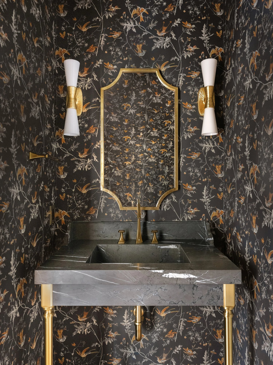
There is no faster way to infuse earthy, atmospheric color into a room than with the right wallpaper, and powder rooms are the ideal canvas. Small in scale, these rooms are seen briefly but felt deeply. Guests linger just long enough to notice every detail, which means every detail must be worth noticing.
The powder bath above does everything right. A dark botanical paper featuring birds, branches, and foliage rendered in warm sienna, charcoal, and silver creates an environment that feels almost like stepping inside a forest at dusk. The pattern is complex and rich, yet the color story remains cohesive: deep, warm, and grounded in nature. A gold-framed mirror with a shaped silhouette reflects the wallpaper back on itself, doubling its impact. The grey veined marble sink, supported on brass legs, continues the earthy-warm palette at eye level.
This room works because every element speaks the same color language: dark, warm, and touched with gold. Nothing competes. Everything amplifies.
Pro Design Tip: In a small space like a powder bath, embrace the pattern fully. Pairing a bold wallpaper with simple, classic fixtures in a single metal finish, as seen here with brass throughout, creates cohesion without rigidity. Let the wallpaper lead, and let everything else follow.
Concept #4
Ground Warm Neutrals with Contrast Anchors
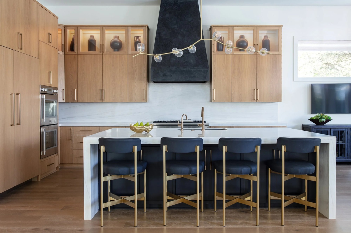
Not every earthy palette needs to be dark or dramatic. Some of the most beautiful rooms we design are built on warm neutrals: honey oak, soft linen, honed stone. Tones that feel immediately welcoming and calm. The art, in those spaces, is in the contrast anchor, the single element that gives the warmth something to lean against.
In the kitchen above, warm white oak cabinetry fills the room with the kind of light, natural beauty that never goes out of style. The wood grain is visible, the tone is golden-gray, and the feeling is one of effortless, organic ease. It is the contrast anchors that make the room extraordinary: a matte black range hood with the weight and presence of a sculpture, a black and brass island base that grounds the lighter cabinetry above, and barstools in a deep charcoa fabric and burnished gold frames that pull the whole palette together. Without these darker elements, the room would be beautiful but soft. With them, it is arresting.
This is the principle we return to again and again. Warmth needs weight. Natural, earthy tones are most compelling when given something darker to play against.
Pro Design Tip: When selecting a contrast anchor for a warm-toned kitchen, consider the range hood as a primary opportunity. It occupies significant visual real estate and is often treated as an afterthought. Treating it as a focal point, in a matte, textured black finish as seen here, elevates the entire room.
Concept #5
Unify the Palette Through Metallic Accents
One of the most elegant techniques for making earthy tones feel cohesive across an entire home is the consistent use of one metal finish throughout. Brass and gold-toned metals are the natural partners of earthy, nature-inspired palettes. They evoke warmth. They suggest age and patina. And they connect spaces that might otherwise feel visually disconnected.
Look across the four rooms above and you will find this truth at work. Brass hardware on the forest green built-ins. Brass drawer pulls threading through the dark pantry cabinetry. Gold-toned fixtures and mirror framing in the powder bath. Brass chandelier arms and barstool frames in the kitchen. The metal is not identical in every room, some pieces lean more antique while others read more polished, but the warmth is consistent. And that consistency is what allows rooms with very different color stories to feel like they belong to the same home.
Metallic accents in earthy, warm tones are the connective tissue of a well-designed interior. They do quiet, essential work, and when done well, you may not notice them consciously. You will simply feel the room's harmony.
Pro Design Tip: If you are mixing metals, which is entirely acceptable and often more interesting than strict uniformity, establish one dominant finish and use the secondary finish as an accent. In an earthy-toned home, warm brass or unlacquered bronze makes an excellent primary, with matte black serving as the grounding counterpoint.
The Beauty of Grounded Color
Earthy palettes ask something of us that cool, neutral interiors do not. They ask us to commit. To trust that depth is not darkness, that warmth is not heaviness, that nature's own colors, forest green, aged wood, dark stone, burnished gold, are among the most sophisticated in the designer's palette.
At Pamela Hope Designs, we believe the homes that feel most beautiful are the ones that feel most alive. And few things bring a room to life the way a grounded, earthy color story can, layered with texture, anchored with contrast, and unified by the quiet confidence of a well-chosen palette.
If your home is ready to come into its own, we would love to help you discover what is possible.
We are off to our next design project.
Fondly,
Pamela Hope Designs
Meet Pamela
A LUXURY INTERIOR DESIGNER IN HOUSTON
Pamela O’Brien is the founder of Pamela Hope Designs in Houston, Texas. Pamela is an award-winning luxury interior designer, writer, and speaker. Prior to founding Pamela Hope Designs, Pamela served as a spokesperson in media and public affairs, working with media outlets like Dateline NBC and 48 Hours. This experience allowed her to travel the world and furthered her love for travel, culture, and interior design. After attending an executive course at the Harvard Graduate School of Design, Pamela launched her own interior design firm full-time. Pamela is known for building strong relationships with her clients, who later become friends and collaborators. She is highly influential in the Houston interior design space and shows no signs of slowing down.

Meet Danna
A LUXURY INTERIOR DESIGNER IN HOUSTON
Danna Smith has more than 30 years of experience in the design industry. She has been a buyer and merchandiser for four luxury showrooms in Houston and Dallas. Smith teaches an evening course at Houston Community College to nurture her passion for developing future design stars. Since joining Pamela Hope Designs in 2015, she has worked on some of her most beautiful and innovative projects yet.