Fall’s most anticipated design news is the announcement of colors of the year. Recently, both Sherwin Williams and Benjamin Moore released their picks for the trend-setting tones of 2018! Both picks are bold and full of energy with very different looks. Let’s dive into these beautiful hues!
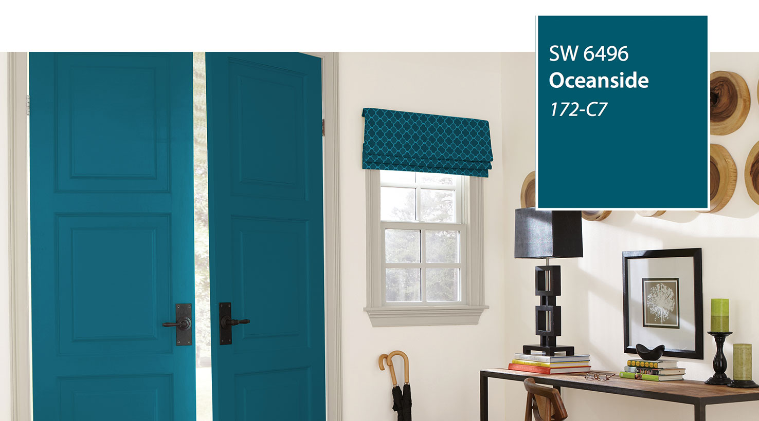
Photo courtesy of Sherwin Williams
Sherwin William’s pick, Oceanside SW 6496, is a mix of rich blue with a jewel-toned green. They describe the color as both accessible and elusive. We’ll surely see more of this color in accent pieces. We love this example of Oceanside on a pair of grand doors.
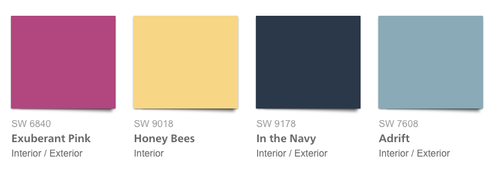
Photo courtesy of Sherwin Williams
Accent color recommendations for Oceanside were also announced; however, they are not for the color-shy! These accent colors are just as vibrant. If Oceanside takes center stage in one of your designs, consider keeping the brighter accent colors to small accessories.
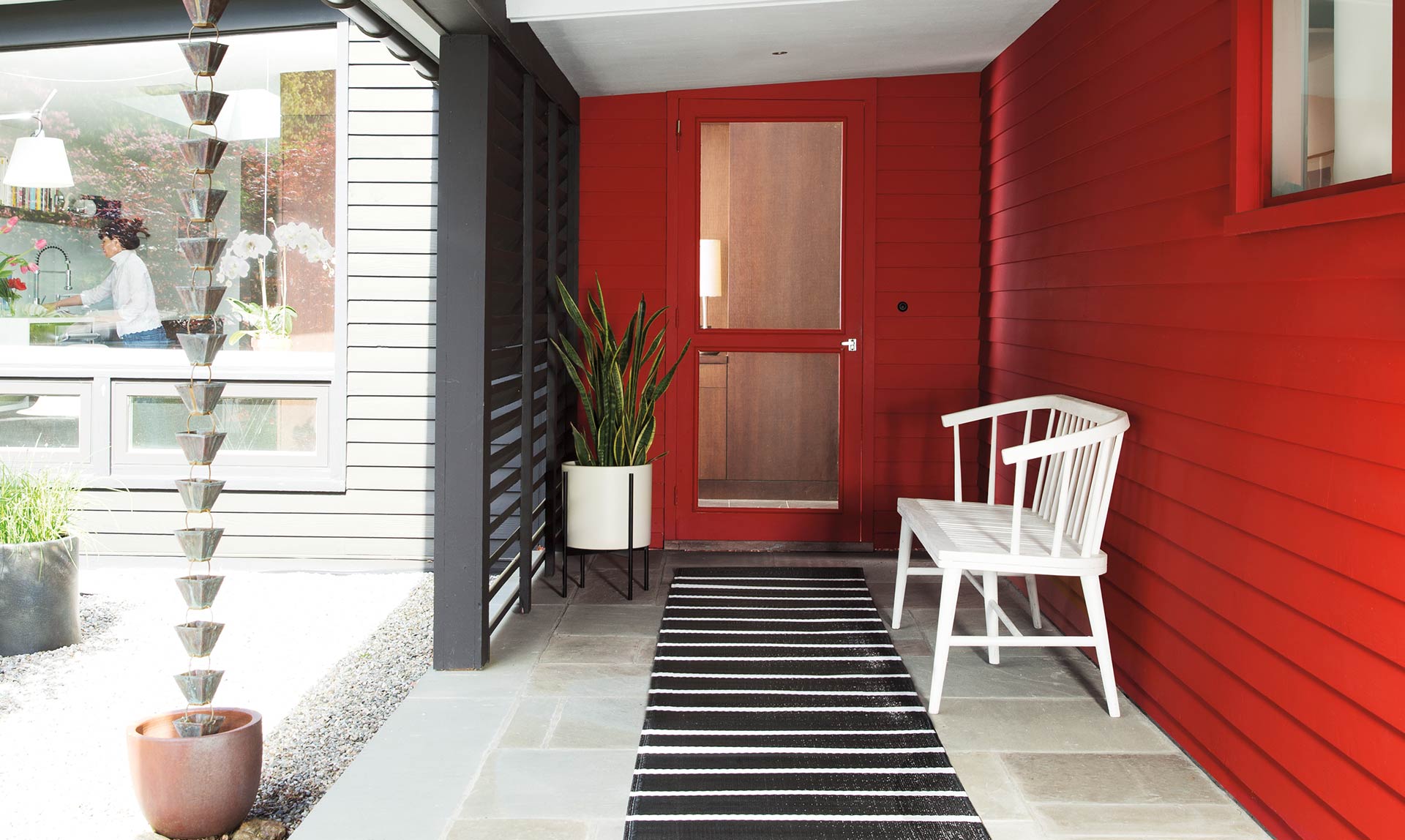
Photo courtesy of Benjamin Moore
Benjamin Moore also chose a bold color for their 2018 pick. Caliente is described as strong, radiant, and full of energy. The bright red has a hint of orange, perfect if you are drawn to warm, red shades. Here’s how Benjamin Moore describes Caliente:
“Caliente is the signature color of a modern architectural masterpiece; a lush carpet rolled out for a grand arrival; the assured backdrop for a book-lined library; a powerful first impression on a glossy front door. The eye can’t help but follow its bold strokes. Harness the vitality.”
—Ellen O’Neill, Benjamin Moore & Co.
This example of Caliente on an exterior of a home is for the bold, but we imagine using the shade in many other ways as well! You can easily warm up flooring with a rug that contains hints of Caliente, paint an accent wall, or choose upholstery in Caliente’s hue.
What will Pantone’s color of the year be? We can’t wait to find out!